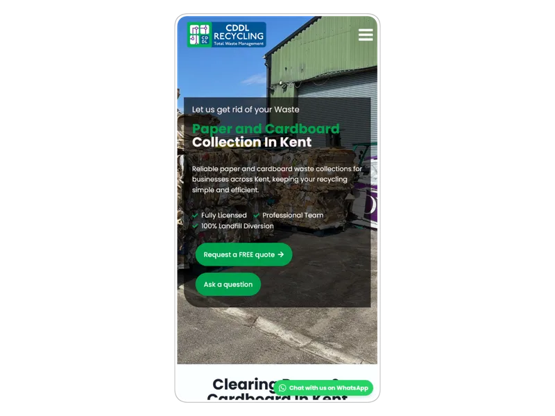
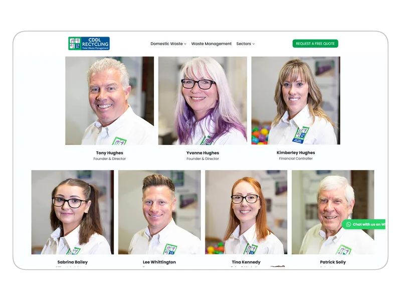
CDDL Recycling
A complete digital overhaul and SEO-focused redesign that delivered a massive 150% increase in organic traffic.
.webp)
The Challenge
CDDL Recycling is a leader in waste management, but their digital presence was invisible. Their previous website was outdated, slow, and not optimized for search engines, meaning they were losing valuable local leads to competitors with inferior service but better websites.
The Breaking Point
"We knew we were the best in the area, but Google didn't. The phone just wasn't ringing enough."
Invisible in Search
Despite their size, they ranked on page 3 or 4 for key local search terms.
Poor User Experience
The old site was difficult to navigate on mobile, where 60% of their customers were searching.
Low Conversion
Traffic that did arrive wasn't converting because the call-to-actions were buried.
Outdated Brand
The visuals didn't reflect the modern, professional scale of their actual operation.
Dominating the Local Market through SEO-First Design.
We didn't just redesign the visuals; we rebuilt the site structure from the ground up based on keyword research.
We implemented a high-performance architecture that Google loves, creating dedicated landing pages for each waste service to capture specific search intent.
SEO Architecture
Restructured the sitemap to target high-value local keywords for skip hire and recycling.
Lightning Fast Load Times
Optimized images and code to ensure near-instant loading, boosting search rankings.
Conversion Pathways
Strategically placed 'Get a Quote' forms and click-to-call buttons for mobile users.
Technologies Used
From Invisible to Indispensable
The new platform turned their website from a static brochure into their hardest-working salesperson.
Traffic Surge
Organic traffic grew by 150% within 3 months of launch due to SEO optimization.
Lead Generation
Online quote requests doubled, streamlining their sales pipeline.
Mobile Dominance
Mobile bounce rates dropped significantly thanks to a responsive, thumb-friendly design.
Brand Authority
The modern aesthetic now positions them as the clear market leader in Kent.
Clean, Green, and Mean
Visuals that build trust instantly.
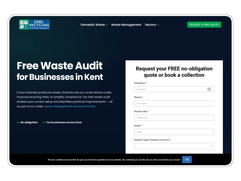
We moved away from the cluttered 'industrial' look to a clean, eco-friendly aesthetic. We used a fresh color palette that emphasizes sustainability, paired with bold typography to make critical information—like service areas and contact numbers—pop instantly.
They were very easy to work with, listened to us and also gave us some great ideas, they are now looking after our SEO and we are getting a lot more inquiries through the web site